Correct map of the world. Real size of countries. Call to action
Have you ever thought about what real sizes of countries different from those shown on maps? In principle, for a Soviet student, such would not be of any interest, since all students knew about them, even with average academic performance.
However, in our time, the data presented in the article may shock some representatives of the new generation of young people.
So, the real sizes of countries and continents differ from what we see on the maps. For example, looking at a map, you might think that Russia is significantly larger than the continent in size. In fact, Africa (≈ 30 million km²) is almost twice the size of Russia (≈ 17 million km²).
Why does it depend? Maybe someone deliberately wants to misinform us? No, friends. It's all about projection.

We offer, which within one minute will demonstrate to you what we wrote about above. Maybe after watching you will understand everything that you did not learn when reading.
If you liked the given scientific facts about the real sizes of countries, share them in in social networks and subscribe in any convenient way.
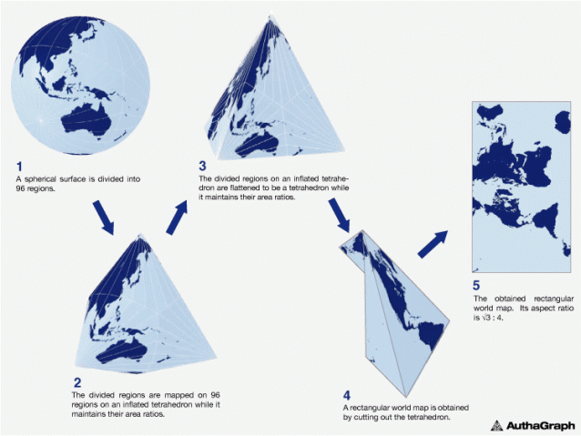
Many people know that familiar to us geographic map of the world does not correctly reflect the real ratio of the areas of countries, and even more so of seas and oceans. Using the Mercator projection leads to many distortions, when, for example, Greenland looks larger than Australia... A fundamentally new projection proposed by Japanese designers made it possible to build the most accurate map of the world that mankind has ever seen.
How did they do it?
The traditional map of the world is built in the old way, in which the image from the surface of the globe is transferred to a flat map using the Mercator projection. As a result, we get on the map Greenland several times larger than Australia, while in fact Greenland is three times smaller ...

But a map built according to the principles of the AuthaGraph projection can be called truly innovative! Here, the proportions of land and water remain unchanged and correspond to what we see on the globe. AuthaGraph received the prestigious Japanese Good Design Award for this development.


Then comes original process transferring the image to the plane by combining various ways projections through intermediate objects. This "layered display" reduces the number of errors and monstrous distortions that occur when the surface of the globe is traditionally unfolded into a flat map.

Of course, it is impossible to achieve complete perfection, but the map from AuthaGraph is as close as possible to it.


How do the authors of the new world map explain the need for its appearance?
"Antarctica was discovered in 1820, and the first person reached the North Pole in 1909. In the 20th century, relations between East and West and North-South problems came to the fore in world politics. The main territorial interest was the land, which was the habitat of man. But since the end of the twentieth century, dwindling resources and problems environment forced to pay attention to the polar regions and the territory of the oceans ...
The AuthaGraphic world map aims to support this new perspective and show what ours really looks like. Earth and the interests of various countries and groups are distributed on it.

According to its creators, new map of the world will allow you to look at the planet and its individual corners from a new angle and get rid of ingrained stereotypes like "Western world", "Far East", "go north".

For comparison: a world map drawn in 1844

1490s world map used by Columbus to persuade Ferdinand of Aragon and Isabella of Castile to support his expedition.

Many are aware that the map of the world familiar to us does not reflect the real ratio of the areas of countries, and even more so of seas and oceans, not too correctly. The use of the Mercator projection leads to many distortions, when, for example, Greenland looks larger than Australia ... A fundamentally new projection proposed by Japanese designers made it possible to build the most accurate map of the world that mankind has ever seen.
How did they do it?

The traditional map of the world is built in the old way, in which the image from the surface of the globe is transferred to a flat map using the Mercator projection. As a result, we get on the map Greenland several times larger than Australia, while in fact Greenland is three times smaller ...

But a map built according to the principles of the AuthaGraph projection can be called truly innovative! Here, the proportions of land and water remain unchanged and correspond to what we see on the globe. For this development, AuthaGraph received the prestigious Japanese Good Design Award.


Then comes the original process of transferring the image to the plane by combining various methods of projection through intermediate objects. This "multi-layer display" reduces the number of errors and monstrous distortions that occur when the surface of the globe is traditionally unfolded into a flat map.
Of course, it is impossible to achieve complete perfection, but the map from AuthaGraph is as close as possible to it.

“Antarctica was discovered in 1820 and the first man reached the North Pole in 1909. In the 20th century, relations between East and West and North-South problems came to the fore in world politics. The main territorial interest was the land, which was the habitat of man. But since the end of the 20th century, dwindling resources and environmental problems have forced attention to the polar regions and the territory of the oceans ...
Hello dear reader! In this article, we will continue the theme of a flat earth and present one more fact proving the correctness of this theory. Do not rush to spit at the monitor if you are a skeptic of this topic, but simply study the proposed material and check it yourself.
Of course, it is not given to a larger number of the population to check what the map of the world in which we live should actually be. But a curious mind always wants to believe that our world is not the way we used to see it. And not only people live on this big earth.
But sooner or later we will figure out all this confusion!))
Map of the World: False or Real?
So, on our agenda. This is how it is presented to us from childhood:
Everything is simple. We find a map of the world of flat earth on the Internet:

What do you see? Doesn't this ratio of continents remind you of the sizes that Yandex showed us? Coincidence or accident?
But that's not all...
Comparison
Here official emblem UN:
![]()
Do you notice anything?
- Firstly, it has just all the continents in relation to each other of the size that the Yandex ruler shows us;
- Secondly, it is very similar to a flat earth map. Don't find?
Question to skeptics - How so?)
Is this a coincidence or have we really been pushed the wrong way since childhood? And most importantly, why are they doing it? And why is Russia artificially enlarged, as if they wanted to scare someone with their mass)) Or cover it up? After all, against the background of huge Russia, Australia is lost visually. Maybe they are hiding something on its territory? And they want people to look anywhere but at tiny Australia? Hmm... One can only guess...
Call to action
Unfortunately, we cannot rise into space, but we have the Internet, brains and eyes. Close all textbooks, we don't know where is the truth in them and where is the lie. Become pioneers without looking back at history.
Start doing practical experiments. For example, get into a car and drive yourself a long distance from one city to another and compare it with the official map on Yandex.
Let's look for inconsistencies in our strange world together.
Take part in the survey
Article in VIDEO FORMAT
Dear Friends, leave your comments and practical observations below this article.
It hides not only the real sizes, but also the continents. We will definitely tell you about one of them on the pages of the site, soon.
If you look at a map of the world, you will probably think that North America and Russia is bigger than Africa. However, Africa is actually three times the size of North America and significantly larger than Russia.
This strange distortion has been investigated by a climate data scientist from the UK National Weather Service (Met Office, Met office), who created a two-dimensional map showing what the world really looks like. It turned out that many countries - including Russia, Canada and Greenland - are not as big as we think. The distortion originates from the Mercator projection - a map that is most often found in classes and in textbooks. It was created in 1596 to help sailors navigate the sea.

What is wrong with the Mercator map?
Africa is about 14 times the size of Greenland, and yet they are almost the same size on the map. Brazil is more than 5 times the size of Alaska, but Alaska is bigger than Brazil on the map. The map shows that the Scandinavian countries are larger than India, while in fact India is 3 times the size of all the Scandinavian countries combined. While Europe looks larger than North America on this map, the opposite is actually true. Russia is also not as big as it is depicted - in fact, Africa is larger than Russia.

The biggest problem with making an accurate map is that it is impossible to depict the reality of a spherical world on a flat map, a problem that has plagued cartographers for centuries. As a result, the shapes of the maps of the world, as a rule, were varied - from hearts to cones. But the variety gradually disappeared with the advent of one model proposed by Gerardus Mercator in 1596. The Mercator projection shows the correct shapes of land plots, but at the cost of distorting their size in favor of land in the north.
Gerard Mercator(March 5, 1512 - December 2, 1594) was a Flemish cartographer, famous for creating a map of the world based on a projection showing sailing routes in straight lines. Although this is what he is best known for, Mercator was more than just a geographer. He also studied theology, philosophy, history, mathematics and magnetism. Mercator was also an engraver and calligrapher, and even made globes and scientific instruments. Unlike other geographers of the time, he traveled little. Instead, his knowledge of geography was based on his library of over a thousand books and maps. In the 1580s, he began publishing his atlas, which he named after the giant in Greek mythology who holds the world on his shoulders. He suffered a series of strokes in the early 1590s that left him partially paralyzed and nearly blind. The last stroke caused his death in 1594 at the age of 82.
Neil Kay, climate data scientist at Met office, has created an accurate map of the world that shows countries in the Northern Hemisphere are much smaller than people usually think. To do this, he entered data on the size of each country in ggplot, which is a visualization data package for statistical programming. He then created a map using the projection stereographic. This is a mapping function that projects a sphere onto a plane. After that, Kay manual setting, adjusting the size of countries that are closer to the poles. Thus, according to Kay, it is not possible to put all shapes back on the sphere after they have already been laid on the plane.
Read also on ForumDaily:
We ask for your support: make your contribution to the development of the ForumDaily project
Thank you for staying with us and trusting! Over the past four years, we have received a lot of grateful feedback from readers who have helped our materials to arrange life after moving to the United States, get a job or education, find housing or arrange a child in kindergarten.
Always yours, ForumDaily!
Processing . . .


